Hey 👋🏻 – Jasdev here.
Welcome to 232 new Defi Design subscribers since last week!
Text, text, long text, link, a couple of images, more text, and more text.
That just about summarises an average homepage on the internet.
But will that look and perform the best? I bet not.
The job of a home page is to inform users about the product or service, and get them excited about taking action. Very few pages do this correctly.
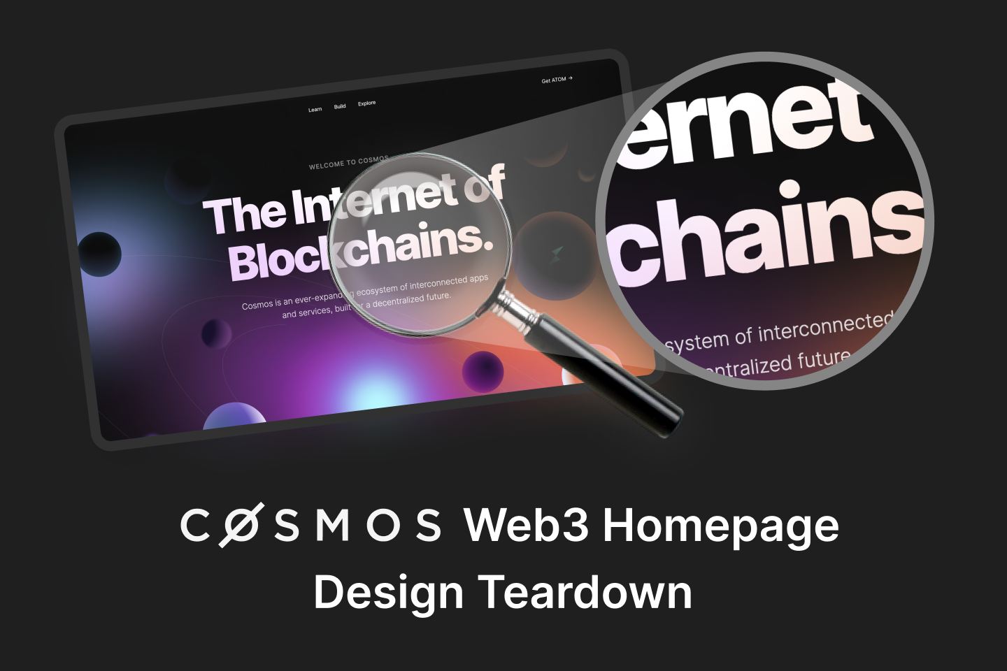
This week I will tell you all about the design nuances of a kick-ass homepage for a web3 product: Cosmos Network.
Cosmos (cosmos.network), is an ever-expanding ecosystem of interconnected apps and services, built for a decentralized future. Its design has been often praised in the industry. Let’s take a deep dive to see why…
Today’s issue takes about 5 minutes to read.
Enjoy.
Design teardown? WTF is that?
A “teardown” is nothing but a deep analysis of anything. A design teardown, means looking at an interface from the eyes of a usability specialist, and deconstructing what is good and what isn’t.
Design teardowns are like post-mortems. They help spot grave mistakes and usability issues. Every product or website should have it done.
Why talk design for web3?
I believe that the adoption of web3 based products is heavily based on how good they look and how easy they are to use. Of course, this is assuming you have a validated business idea first.
web3 companies are asking people to trust them with their money, and wish to shift the global financial landscape from Cefi to Defi.
When you pair a disruptive idea with poor design – you’ll be met with resistance. web3 perfectly fits the bill and presents a huge design challenge.
So, how can we all help to keep the adoption going?
We start with what we can control – design.
The web3 design evaluation checklist
After closely studying over 45+ web3 home pages, I’ve observed a plethora of design patterns – both good and bad.
Making an effective web3 home page is half art and half science.
“Science” is things like grids and layouts, information hierarchy, ease of navigation, social proof, and accessibility.
“Art” part focuses on simplicity, aesthetics, consistency and responsivity.
We’ll cover just 3 checklist points in this newsletter.
These 3 points are just the tip of the iceberg. I’ll release the full 30+ points checklist (with instructions how to use it), in an upcoming issue of this newsletter.
1. Aesthetics and design (Lookin’ sexy?)
Fun fact: according to the Aesthetic Usability effect, users often perceive aesthetically pleasing design as design that’s more usable.
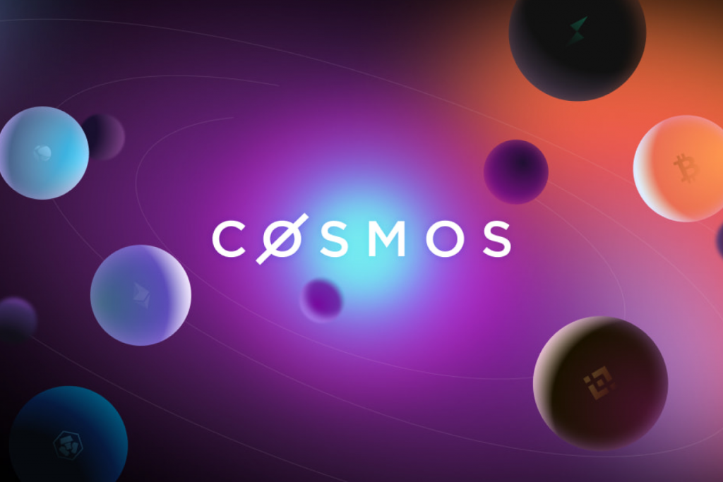
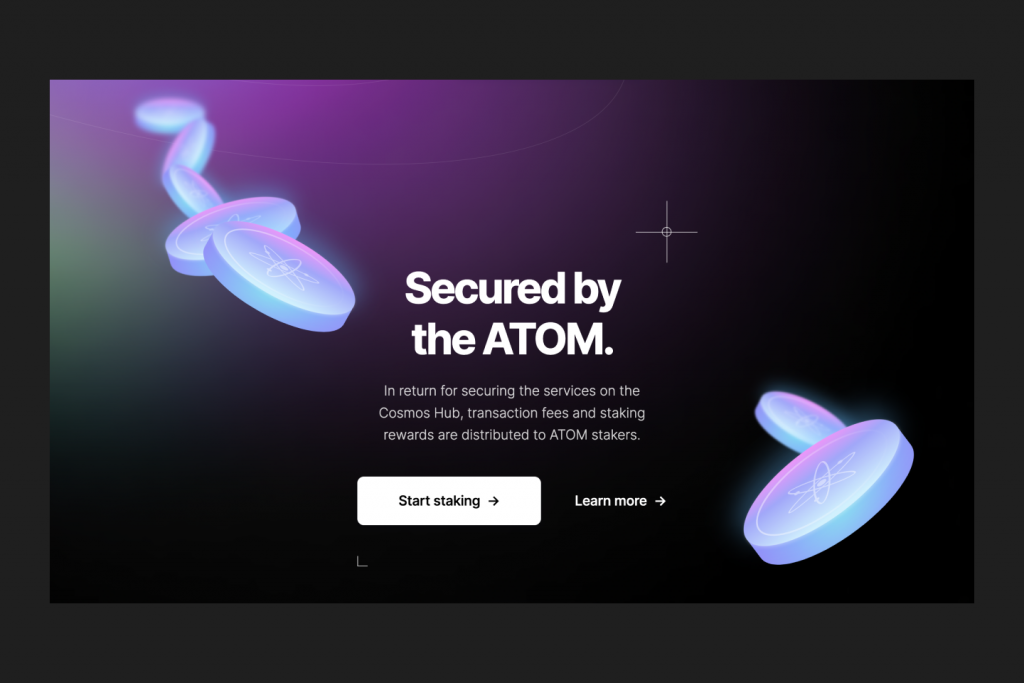
Cosmos is one of the best examples of the current web3 trends across the industry. They use colorful hues, dark mode, space themed 3D elements, planets and orbits, playfulness with light and shadows – all done so magically well!
The “Internet of Blockchains” copy is outstanding, and combined with the planetary background really drives the message home – that they are a collection of decentralized ecosystems. Plus, the planets are interactive on hover!
The space and planet theme trickles down from big background elements all the way to small images and icons.
Score: ⭐️ ⭐️ ⭐️ ⭐️ ⭐️ / 5
Now, your turn. Evaluate aesthetics of your homepage:
✔ Use a max of three (plus or minus one) different colors
✔ No unnecessary design elements (those which serve no functional purpose)
✔ Use high quality images, videos, illustrations, etc
2. Visual hierarchy (Information structured for users?)
Visual hierarchy is the principle of arranging elements to show their order of importance.
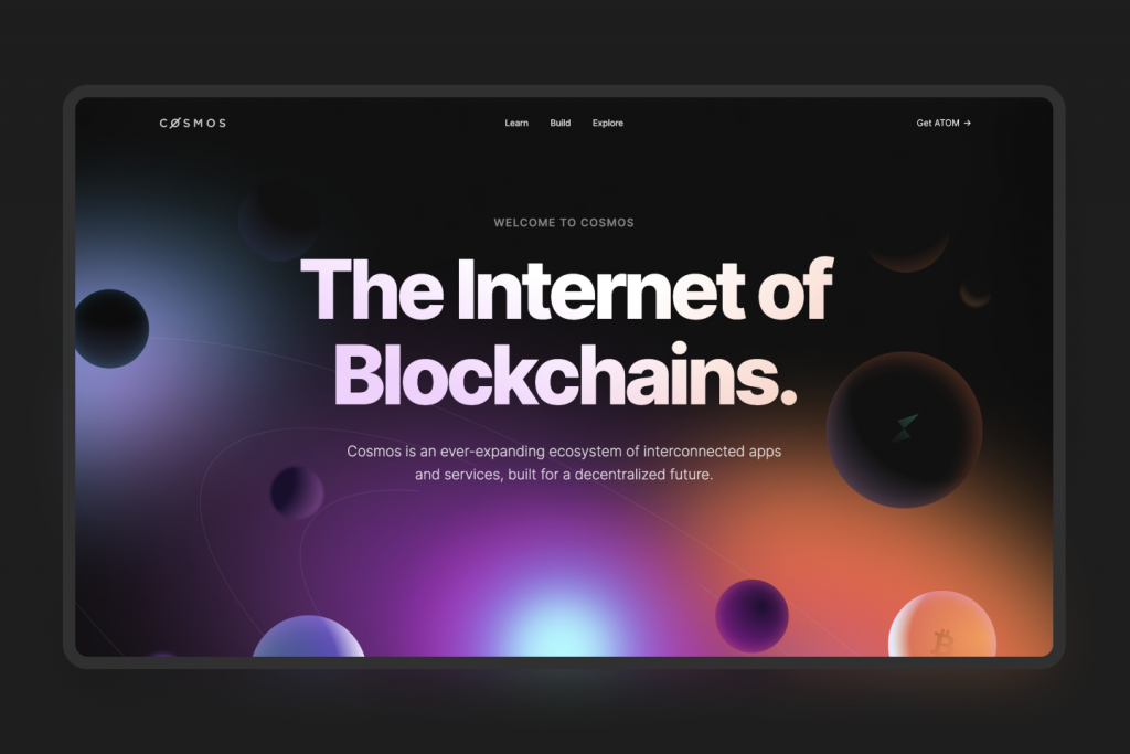
Cosmos has an excellent visual hierarchy with typography that scales, big bold attention grabbing headings, clear call to actions, high-contrast text and backgrounds.
They use ample white space to break up text and other elements into distinct sections.
They communicate the value proposition of each section well. Jargon free language which most users can understand. Paragraphs are short – no paragraph is longer than 3-4 lines. The smallest font size is legible.
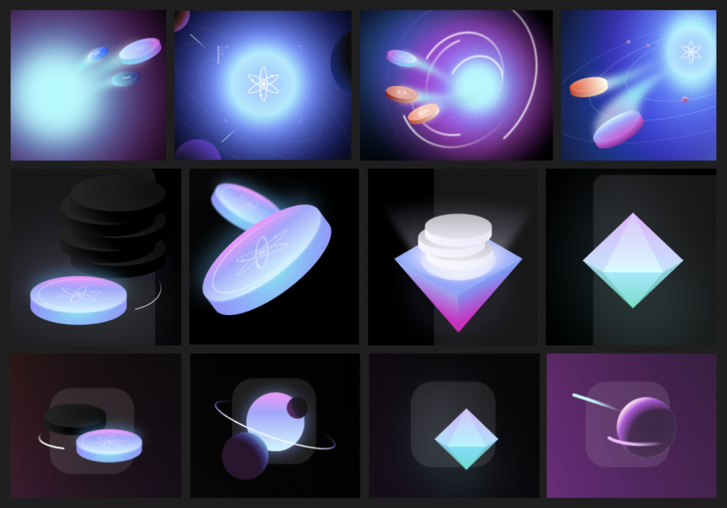
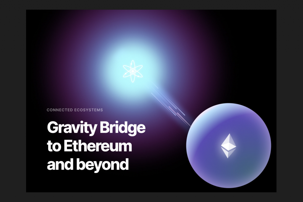
The use of illustration and images is done in a way to support the point being said in the respective section. Eg: the illustration below shows bridge like lines between two entities, and a feeling of ‘gravity force’.
Score: ⭐️ ⭐️ ⭐️ ⭐️ / 5
Now, your turn. Evaluate visual hierarchy of your homepage:
✔ Big bold attention grabbing headings. Short paragraphs, no longer than 3-4 lines
✔ Call to actions (buttons/links) should stand out – clear, well labeled, and appear clickable
✔ Ample white space to break up text and other elements
3. Credibility and trust (Is it a scam or not?)
If I can’t trust you – it doesn’t matter how awesome of a product you have, I’m not going to use it.
Trust goes a long way, especially in web3, where we’re hearing about scams everyday.
Cosmos pays special attention to this by being as transparent as they can about themselves.
Be it their protocol features, displayed beautifully in a section.
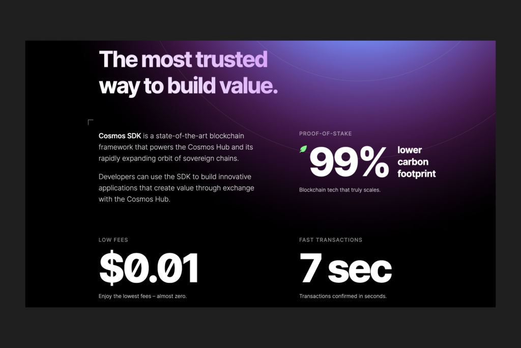
Or be it the count of apps in their ecosystem. Or the total value of assets under management. Everything is shown publicly.
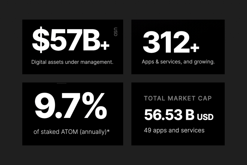
They even go an extra mile to show how things are done under the hood by providing clear documentation of how the protocol works.
They also focus on more trust building off the site in places like Discord and Twitter.
Score: ⭐️ ⭐️ ⭐️ ⭐️ / 5
Now, your turn. Evaluate credibility of your homepage:
✔ Be transparent with your protocol’s statistics. Can anyone see them publicly?
✔ Testimonials, ratings, and reviews from users
✔ Help and support is easily accessible
In summary
Cosmos design choices that I love:
- 🖤 Dark mode
- 🧊 3D elements
- 🪐 Space-theme
- 🌈 Colorful gradients
- ⬆ Very good visual hierarchy
- 👤 Transparency of protocol statistics
Try doing this yourself!
These 3 points are just the tip of the iceberg. Try to evaluate your homepage through the lens of these 3 points.
If you find something interesting, share it with me! I’d be happy to know that this newsletter helped you.
There is a more detailed way that I practice, The Ultimate Web3 Design Checklist.
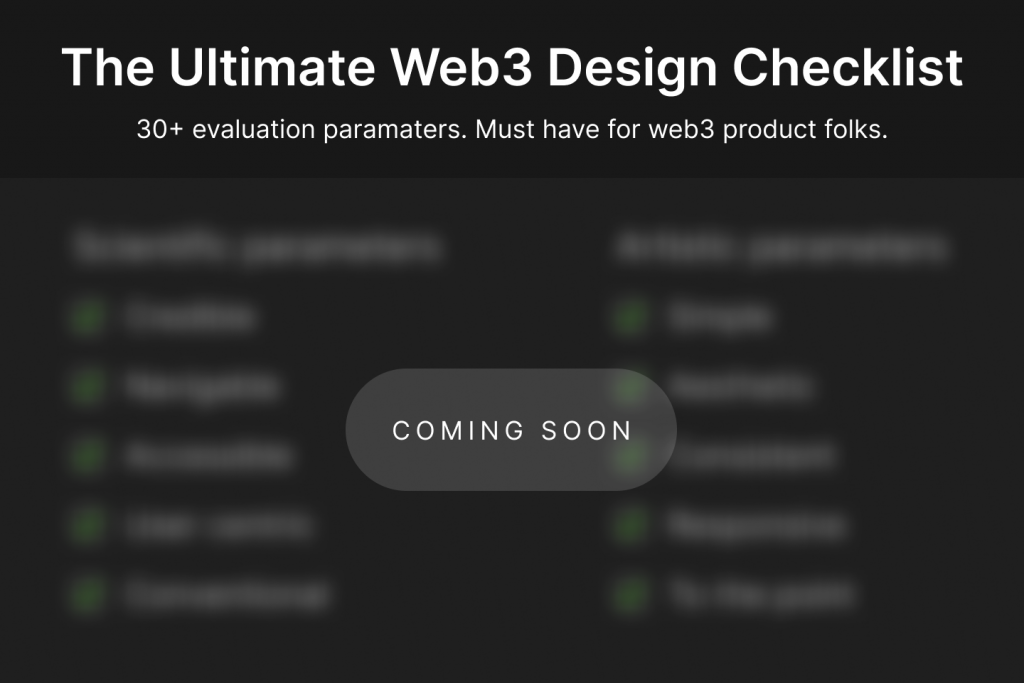
I’ll release the full checklist (with instructions how to use it), in an upcoming issue of this newsletter. Subscribe if you still haven’t.
What do you think of this newsletter overall? I’ve just begun my newsletter journey last month, so open to receiving feedback or tips.
That’s a wrap. See you again next week.
Whenever you’re ready, there are 3 ways I can help you:
1. DM me with your questions. Just hit reply and ask anything.
2. Invite me to speak in a podcast or interview.
3. Work 1:1 with us to get your web3 homepage designed.
One response to “Defi Design #03: Design teardown of a kick-ass web3 homepage”
Great post.